
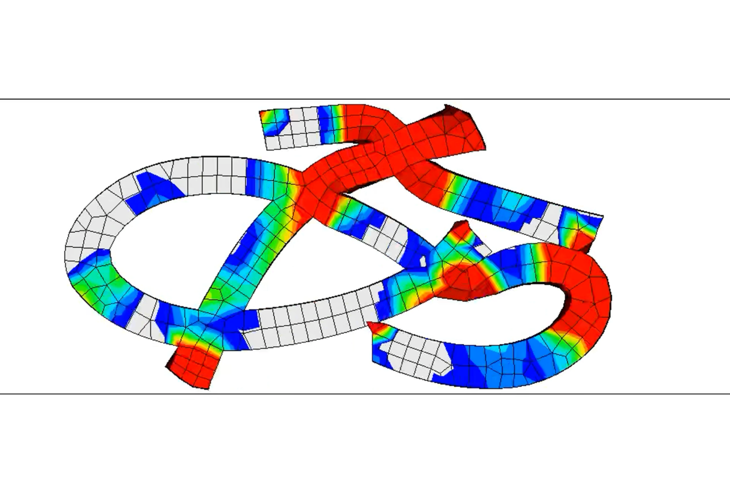
はじめに
Nature Architects では様々な幾何形状を活かした設計が行われており、思いもよらない形が優れた性能を発揮する例が多くあります。
こうした設計を行う上で、多様な形状を知っておくことは非常に有意義です。ここでは弊社でまだ扱っていない形状である文字に着目し、様々な角度から学んでみようと思います。
文字とは
文字とは情報を伝達するための記号です。見やすく見分けやすいことが求められ、それゆえにシンプルながら個性的で洗練された形をしています。この形状の特徴が力学的な性能にどのように影響を及ぼすのか気になりますよね。この記事では特にひらがなを取り上げてお話していきます。
ひらがなの形はどのようにできているの?
まずはひらがなの形状について理解したいと思います。
成り立ち
ひらがなは日本の文字体系の1つであり、その起源は平安時代にまで遡ります。その時代、中国から伝わった漢字が万葉仮名として使用されていました。これが多くの人に習熟されるにつれて草書に書き崩した字体が現れ、草仮名と呼ばれるようになりました。その後、読み書きの容易さを重視して簡略化したひらがなが生まれたのです。[1]
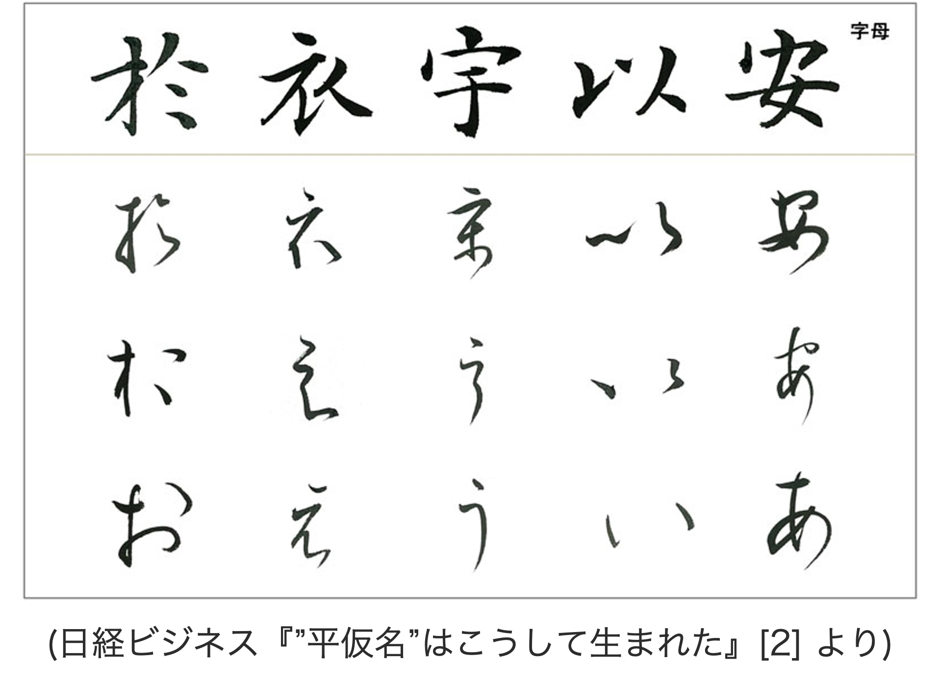
漢字が主に男性貴族や官僚に使用されていたのに対し、ひらがなは女性や一般庶民に広く使われ、特に文学作品や日常の書簡などで多用されました。そうした文化の中で文字を美の対象とする意識が人々に芽生え、次第に変化を求めて一音節に複数の字体が用いられたり、字形の優美さが追求されたりするようになりました。[3]
最終的に今の形になったのは1900年(明治33年)です。活版印刷や教育の普及による字体数の減少の後、小学校令施行規則改正によって一音節一字体に統一され現行のひらがなができました。
特徴
ひらがなは平安時代の日本の美意識を色濃く反映しています。その形状は筆由来の有機的で自然な曲線 [4] によって構成されており、柔らかな印象を与えます。また各文字が独自の曲線美を持っていることも特徴の1つです。
さらに、ひらがなの形状は使用されるフォントによっても大きく異なります。
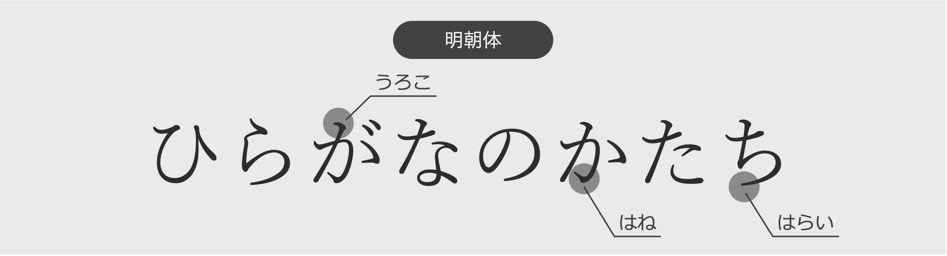
例えば、明朝体の文字は、筆で書いたような形をしていて、とめ, はね, はらいなどの装飾的な要素がある, 横線より縦線が太いといった特徴があります。可読性が高く古典的でフォーマルな印象を与えます。
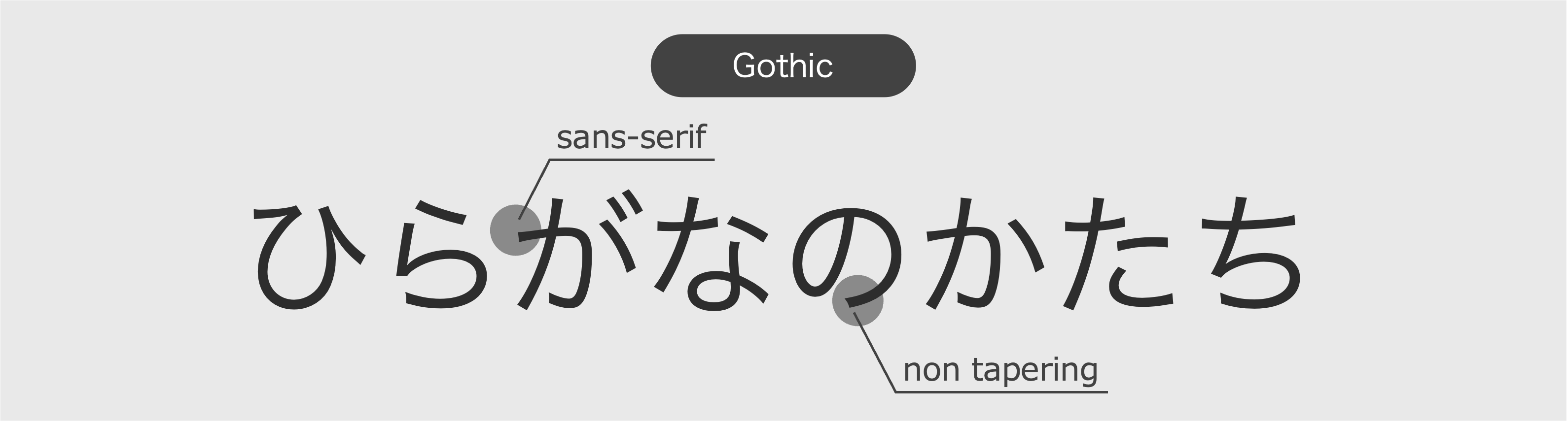
一方、ゴシック体の文字は、装飾がない, 線の太さが均一であるのが特徴です。視認性が高く現代的でカジュアルな印象を与えます。またゴシック体の先端を丸くした丸ゴシック体は親しみやすい印象を与えます。
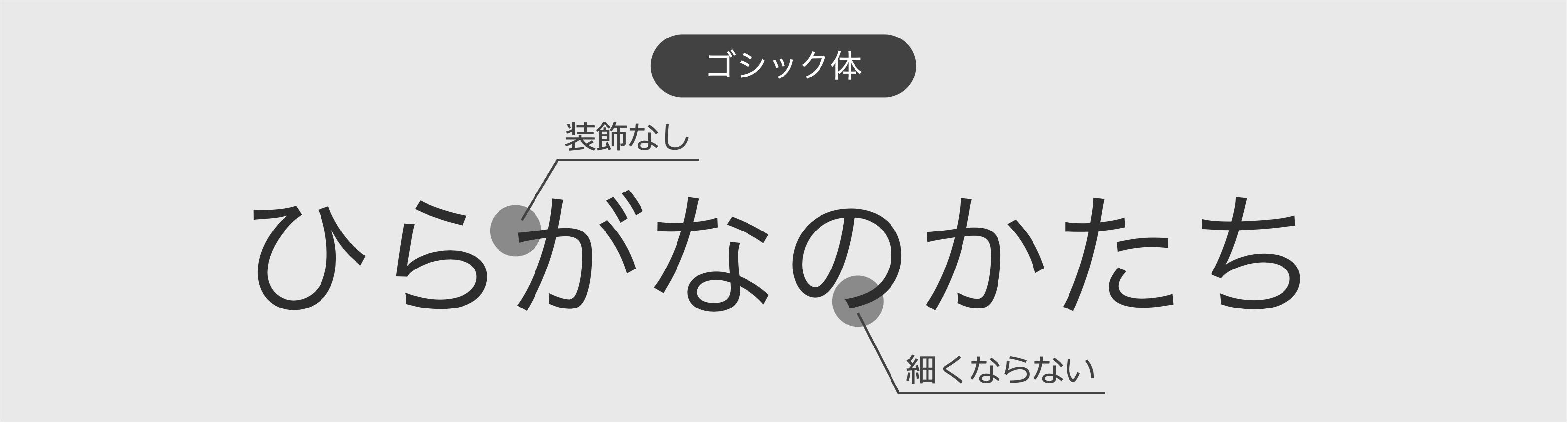
ちなみに本記事ページに使われているヒラギノ角ゴ ProNは、ゴシック体の1つであり現代的な明るさを残しつつもオーソドックスな印象を与える書体 [5] になっています。
その他にも、文字を習う人のため手書きの文字に近くなるよう考慮された学参フォント, ユニバーサルデザイン(UD)に対応し判別性の高いUDフォント, デザイン的に工夫されたデザインフォントなどが存在します。このようにフォントは、目的や用途に応じて使い分けられ文字の持つ多様な表現を引き出す、重要な形状要素となっています。
ひらがなの力学的な特性は?
形状の由来, 意図を学べたところで、次は実際に動かして挙動を見てみましょう。
方法
今回は以下の環境で動かします。
- Rhino/Grasshopper 3D-CAD
- Ansys LS-DYNA 動的陽解法による解析の実行に用いるCAE
( 1 ) 文字の取得
GrasshopperのQuery Installed Fonts (Fonts)とText On Surfaceという2つのコンポーネントを使うことで、好きな文字とフォントを選んで曲線として出力することができます。あるいは、Adobe illustratorを使えば様々なフォントで文字を表現できます。これをアウトライン化してSVGファイルに書き出すと、Grasshopperに曲線としてインポートできるようになります。
( 2 ) モデルの作成
曲線を押し出してSolidモデルに、材料の割り当てをしてメッシュを切ります。寸法, 材料は何でもよいですが、ここでは押出距離を文字の縦横の長さの25%程度に, 材料を押出材として一般に使用されるA6061-T6, 破壊を考慮しない多直線弾塑性のモデルに設定しています。
( 3 ) 解析
準備ができたら動的陽解法による衝突解析にトライします。
解析
わたしはNoto Sans JP - Regularでひらがなのモデルをつくりました。
ちなみにこのフォントは、ゴシック体の1つであり縦横の太さが同じであること, 癖のないオーソドックスな形状であることから、一般的なひらがなの傾向を掴めることを期待して選びました。
上下に剛体の板を用意して上から押してみます。
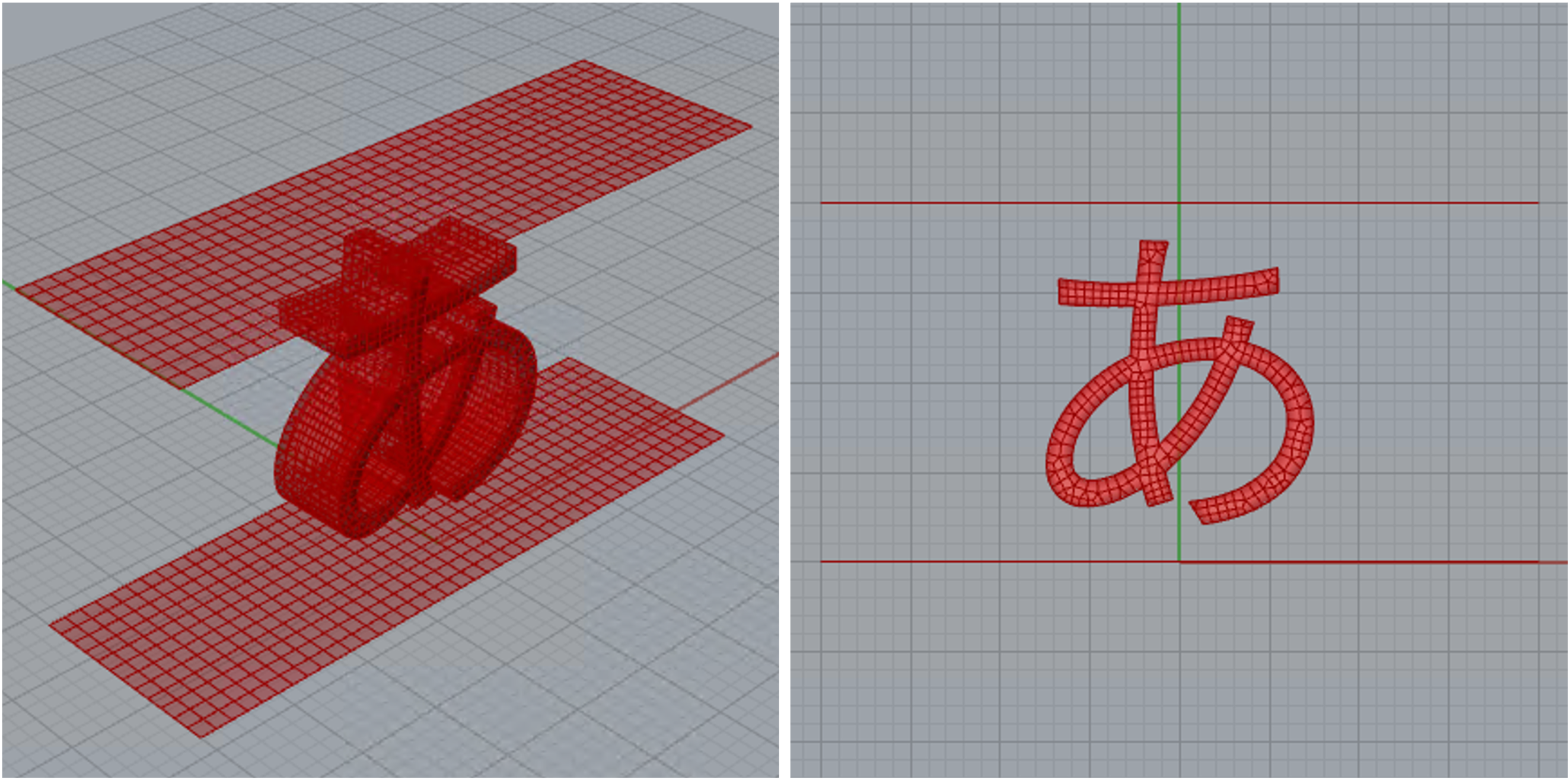
50音を順に押しつぶしてみました。
きれいにつぶれていますね。個人的には小さいパーツに注目して見てみるのもおすすめです。動きがコミカルで視覚的なたのしさを味わえます。また文字ごとに変形の様子が大きく異なることがわかりますね。文字の形状による変形の違いを評価してみましょう。
評価
今回はエネルギー吸収量(EA量)を用いて評価してみます。これは外部から力を受けたときにどれぐらいのエネルギーを対象が吸収するかを表す指標で、対象の衝突物に対する反力\(F\)を衝突距離\(s\)で積分することで算出されます。自動車などの衝突安全の分野でよく用いられ、基本的には大きいほど他の部品に衝撃を伝えないためよいとされます。
\(EA=\int_{s | F(s) < F_{limit}} F(s) ds\)
ここでは反力が基準値\(F_{limit}\)以下のときを積分対象として区分求積的にEA量を算出しています。(これには、対象がつぶれ切って急激に反力が増加する部分を除外する一方で、つぶれ切る前に一時的に基準値を超えてしまった場合はその後の反力を考慮する、といった意図があります。) 基準値は、普通は他の部品との兼ね合いで決まっているのですが、今回そういった制約はないので、形状によるつぶれの違いをよく表現できる適当な値(3N)に設定しています。
ひらがな50音のEA量を以下にまとめました。
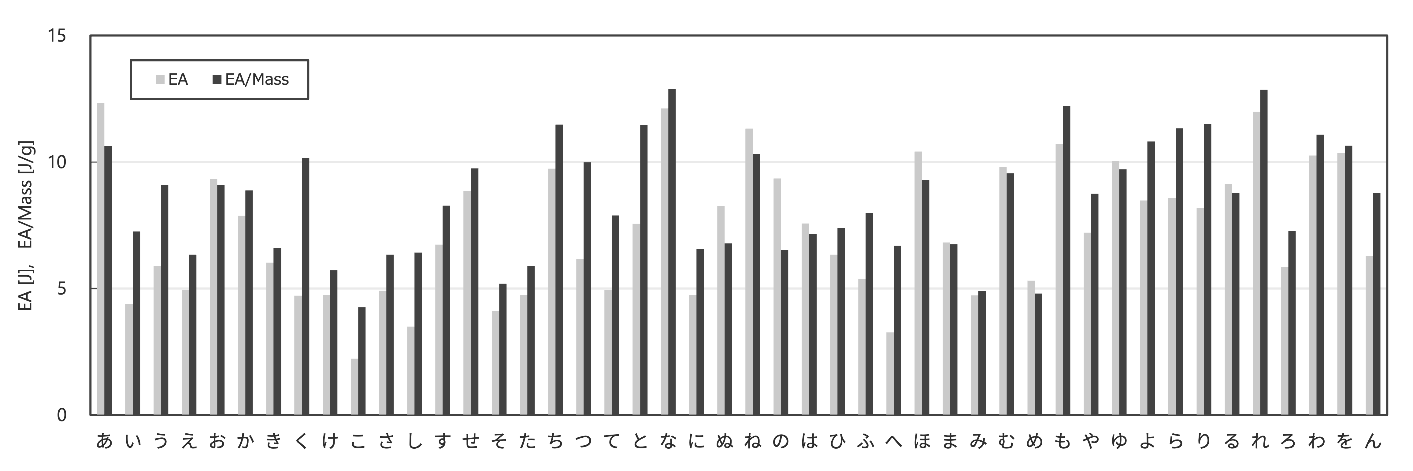
「あ」「ね」「も」「れ」「わ」といった、一体で縦線が通った形状がよくエネルギーを吸収することがわかります。理由は、① 形状が一体となっていることで、全体が連動してバランスよく変形しそのひずみがエネルギーを蓄えるため, ② 縦線があることで、衝突の早い段階から衝撃を受け止めることができるためです。また体積が大きくなれば反力が増加し必然的にEA量も増加します。構造的な傾向を見るために質量あたりのEA量も考慮するのがいいでしょう。質量効率のよいエネルギー吸収にはひずみをよく蓄えられる座屈が非常に有効であり、これを誘発するような曲線や長く続く線があるのも上記の形状のポイントであると考えられます。反対に「い」「け」「こ」「た」といった、丸みの少ないパーツがバラバラに置かれた形状というのはエネルギー吸収には向かないようです。
考察
面白いものがたくさんありますが、中でも興味深い「な」の形状を取り上げて観察してみます。というのも「な」は構成要素が3つに分かれたバラバラな形状であるにも関わらず、質量あたりのEA量が50音の中で最も大きいという結果になったのです。
「な」の変形の様子と、FS曲線(Force-Stroke Curve, 対象の反力\(F\)を衝突距離\(s\)でプロットしたもの)を示します。
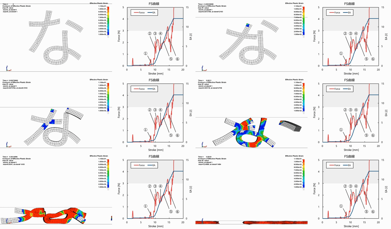
FS曲線を見ると、①→②で急激に反力が上昇し、その後は上下しながらも⑥まで概ね一定の反力を保っています。
衝撃吸収においては、反力が一定値を出し続けられる形状というのは非常に優秀です。制約となる上限反力(基準値)を少し下回る反力を出し続けられれば、最大効率でエネルギーを吸収できるからです。これが達成できていれば、全体の反力のオーダーは体積を大きくするなどして比較的楽に調整ができます。
さらに詳しく見てみましょう。ひずみの分布をもとに、どの部分が主としてエネルギー吸収に寄与しているのかを確認しました。時系列に沿って以下に整理しています。(説明のため、「な」の1, 2画目を”交線要素”, 3画目を”点要素”, 4画目を”むすび要素”と呼ぶこととします。)
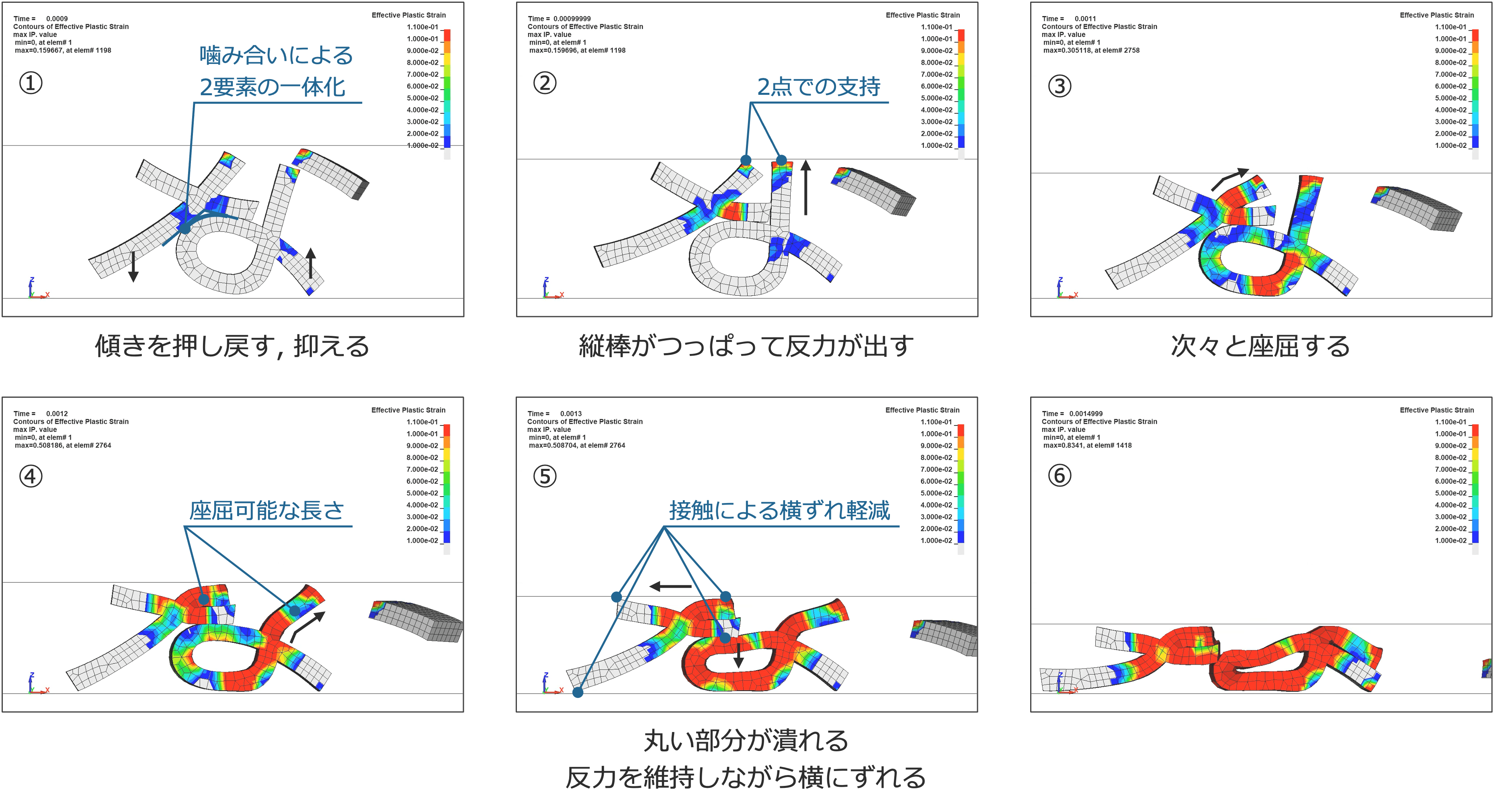
① 一体化
バラバラの3つの構成要素が上部の剛体に押されて接触します。その際に、交線要素がむすび要素の丸い部分に対して接線の関係となることで、2つの構成要素が上手く噛み合い、その後一体となって力を受けます。右に傾いたむすび要素を交線要素が押し戻し、むすび要素の終点が傾きを抑制します。
② 圧縮
むすび要素の縦棒が剛体に垂直につっぱって反力を出しはじめます。これがFS曲線の立ち上がりに寄与しています。
③,④ 座屈
縦棒が次々と座屈し、概ね一定の反力を保ちます。
⑤ 座屈と横すべり
むすび要素の丸い部分をつぶしながら、交線要素が左へとずれていきます。この間、各部の座屈と横すべりによって反力が調整され保たれます。また交線要素の4つの端部がそれぞれ剛体, むすび要素と接触して横すべりを軽減することで、比較的長い間、2つの構成要素が離れずに力を受け続けられます。
⑥ 分離
交線要素の横すべりが限界に達します。その後、2つの構成要素の重なりがなくなることで反力は一時的に低減しますが、徐々に上昇しつぶれ切るに至ります。
まとめ
上記の様子から、形状的に重要なポイントをまとめると以下の2点になります。
-
交線要素の角度がむすび要素の丸い部分の曲率に対して適切である
⇨ 2つの構成要素が上手く噛み合い、一体となって力を受けられる -
交線要素とむすび要素の上下方向の長さ, 変形のしやすさが概ね同程度である
⇨ 左右でバランスよく座屈し、支え合う
交線要素の角度については、以下ように説明されます。
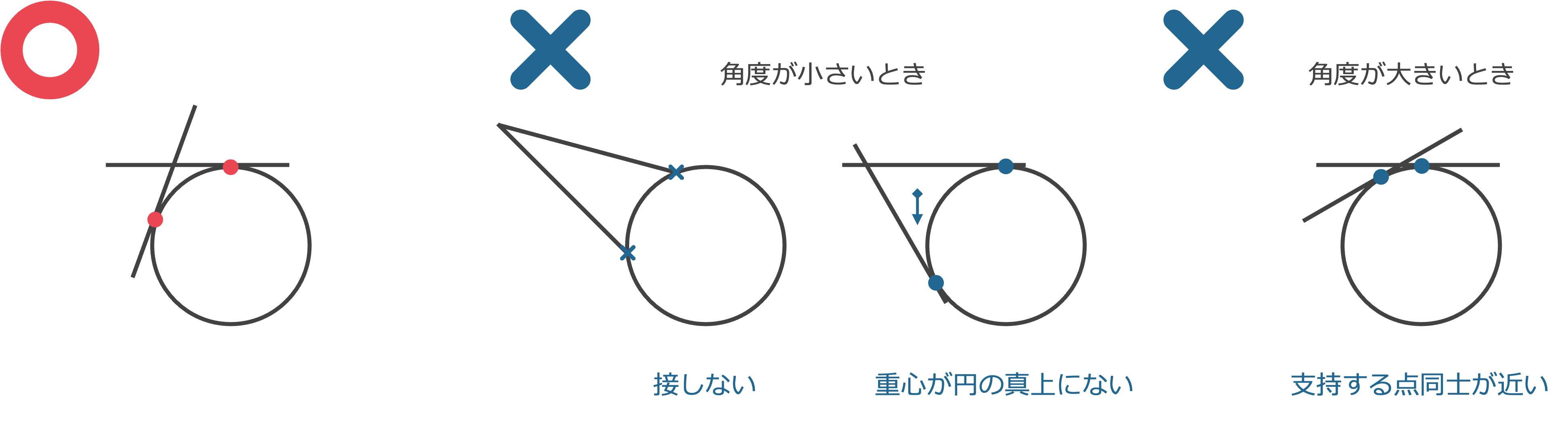
図は交線要素, むすび要素をそれぞれ直線, 円で模式的に表したものです。適切な角度のとき、交線要素がむすび要素の上に安定的に存在するのに対して、そうでない場合には安定せず2つの構成要素が離散してしまいます。例えば、角度が小さいときには、円に接することができない、あるいは接したとしても交線要素の重心が円の左側に位置するため、下向きの力を受けたときに左に傾きやすくなります。また、角度が大きいときには、支持する点(接点)同士の距離が近いため、外力に対してモーメントを受けやすくこれも安定しません。このように、角度が小さすぎず大きすぎない適切な値のときに、2つの構成要素は離れずにいられるのです。
こうして見ると、形状の偶然にも思える絶妙なバランスによって、効率的なエネルギー吸収が行われていることがわかります。
しかしこれは本当に偶然の産物でしょうか。ひらがなの成り立ちを思い出してみてください。「な」は元々漢字の「奈」からできており、「大」部分が交線要素と点要素に「示」部分がむすび要素になっています。そう考えると、交線要素とむすび要素の丸い部分は両方とも横線+左はらいからできているので、交線要素がむすび要素の曲率に対して適切な角度をとるのは必然なのかもしれません。また、2つの構成要素の高さが同程度であることについては、漢字の上下(部首とそれ以外)が等分される傾向に由来している、と考えることもできるでしょう。(ということは、漢字にはよりエネルギー吸収性に優れた形状が潜んでいるのでしょうか…?) こんな想像をしながら挙動を観察してみるのもたのしいですね。
おわりに
形状探索の一例としてひらがなを取り上げて、その形状と力学的な特性を調査してきました。ひらがなが動きつぶれる様は幾何形状にはない個性がありとても魅力的に感じられます。特に「な」に焦点を当てた観察では形状のバランスがエネルギー吸収の鍵を握っていることわかり、改めてひらがなの洗練された美しさと形状設計の奥深さを認識することができました。また歴史やデザイン的な特徴にも目を向けることで新たな気づきを得ることができたように思います。一見小難しそうにも思える形状探索ですが、好きな形を自由な視点で覗いてみるだけで、発見がありたのしいのではないでしょうか。少しでもこの記事を読んでひらがなおよび形状探索の魅力・可能性を感じていただけていれば幸いです。
また弊社HPには、ものの形状について独自の視点でエンジニアが解説した記事が多数あります。興味のある方はぜひ一度読んでみてください。
・双安定ヒンジキャップについて | Nature Architects inc.
・動的陽解法で紐解く競技用立体パズルの進化 | Nature Architects inc.
最後まで読んでいただきありがとうございました。
参考文献
[1] 小学館, “平仮名”, 精選版 日本国語大辞典, 2005/12, 3巻
[2] 木下 真理子, “‘平仮名’はこうして生まれた”, 日経ビジネス, 2018/01/23 : https://business.nikkei.com/atcl/report/15/280393/092100015/ (2024/07/18閲覧)
[3] 平凡社, “平仮名”, 百科事典マイペディア : https://kotobank.jp/word/平仮名-613766 (コトバンクに掲載の内容, 2024/07/18閲覧)
[4] Min-Young Kim, “Type classification in CJK: Japanese”, Google Fonts : https://fonts.google.com/knowledge/type_in_china_japan_and_korea/type_classification_in_cjk_japanese (2024/07/18閲覧)
[5] モリサワ, “ヒラギノ角ゴ ProN”, Morisawa Fonts : https://morisawafonts.com/fonts/475/ (2024/07/18閲覧)
Introduction
Nature Architects takes advantage of a variety of geometric shapes in its designs, and there are many examples of unexpected shapes that provide excellent performance.
It is very meaningful to know a variety of shapes for such designs. I will focus on a shape that we have not yet handled, the letters, and try to learn about it from various angles.
What are letters?
Letters are symbols used to convey information. They must be easy to see and distinguish, which is why they have simple yet unique and sophisticated shapes. You may be wondering how the letters of these shapes affect their mechanical performance. In this article, I will discuss Hiragana in particular.
How are Hiragana shapes formed?
First of all, we would like to understand the shapes of Hiragana.
Origins
Hiragana is one of the writing systems in Japan, and its origins date back to the Heian period (794-1185). During that period, Kanji letters imported from China were used as Manyogana. As more and more people became proficient in this system, a written-down form appeared like cursive script, which came to be known as Kusagana. Later, Hiragana, a symplified version of Kusagana, was created for ease of reading and writing.[1]
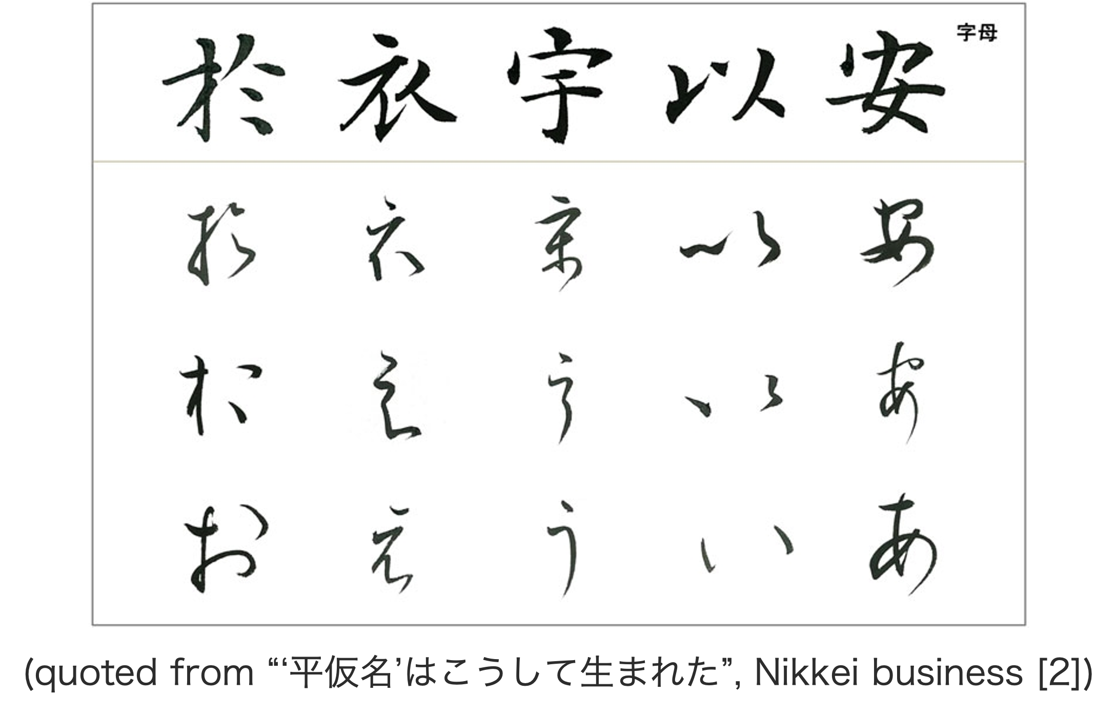
While Kanji was mainly used by male aristocrats and bureaucrats, Hiragana was widely used by women and the general public, especially in literary works and daily correspondence. In this culture, people developed an awareness of the beauty of letters, and gradually began to use multiple glyphs for a single syllable and to pursue elegance of letter form in pursuit of variety.[3]
The current form was finally adopted in 1900. After the number of glyphs decreased due to the spread of letterpress printing and education, the revision of the Ordinance for Enforcement of the Elementary School Ordinance unified the letters into one syllable, one glyph, and the current Hiragana was created.
Characteristics
Hiragana strongly reflects the Japanese aesthetic sense of the Heian period. Its shape is composed of organic and natural curves [4] derived from the brush, giving it a soft impression. Another feature is that each letter has its own unique curvilinear beauty.
Furthermore, the shape of hiragana varies greatly depending on the font used.
For example, the Mincho letters are characterized by a brush-like shape, with decorative elements such as tome, hane, and harai, and vertical lines that are thicker than horizontal lines. They are highly readable, classical, and formal.
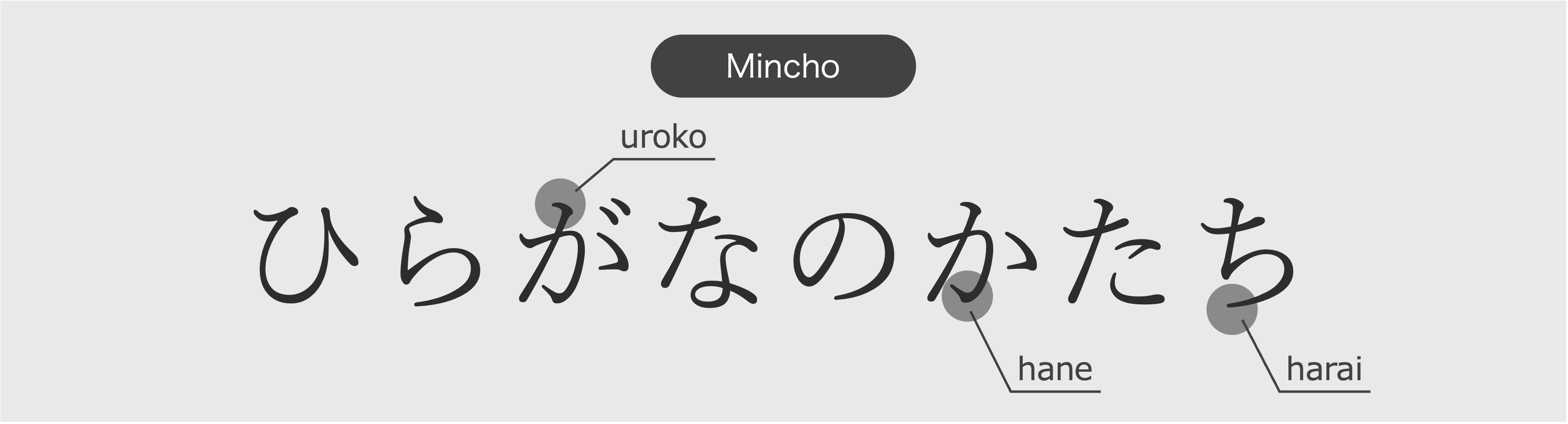
Gothic letters, on the other hand, are characterized by the absence of ornamentation, uniform line thickness. They are highly legible, modern and casual. Rounded Gothic, with its rounded ends, gives a friendly impression.
Hiragino Kaku Gothic ProN used on this article page is one of the Gothic typefaces [5] that gives an orthodox impression while retaining a modern brightness.
There are also academic fonts designed to closely resemble handwritten letters for those learning to write, universal design (UD) fonts that are highly distinguishable and compatible with universal design (UD), and design fonts that are ingenious in terms of design. Fonts are used for different purposes and for different applications, and are an important form factor that brings out the various expressions of letters.
What are the mechanical properties of Hiragana?
Now that we have learned the intent of the shapes, let's actually move it to see how it behaves.
Method
This time, we will use the following environment.
- Rhino/Grasshopper 3D-CAD
- Ansys LS-DYNA CAE used to run dynamic explicit analysis
( 1 ) acquiring letters
Using Grasshopper's Query Installed Fonts (Fonts) and Text On Surface components, you can select the letters and fonts you want and output them as curves. Alternatively, you can use Adobe illustrator to represent text in a variety of fonts. This can then be outlined and exported to an SVG file, which can then be imported into Grasshopper as curves.
( 2 ) Creating models
Extrude the curves to Solid models, assign materials and divide into meshes. Any dimensions and materials can be used, but here the extrusion distance is set to about 25% of the length and width of the letter, and the material is a multi-linear elasto-plastic model of A6061-T6, which is commonly used as an extrusion material, with no consideration of fracture.
( 3 ) Analysis
When you are ready, try crash analysis using the dynamic explicit method.
Analysis
I used Noto Sans JP - Regular for the Hiragana model.
I chose this font because it is one of the Gothic fonts, has the same thickness in vertical and horizontal lines, and has an orthodox shape with no peculiarities, so I expected to get a general tendency of Hiragana.
I prepare rigid boards on the top and bottom, and press from the top.
I crushed Hiragana in the order of the Japanese syllabary.
It's crushed nicely. I personally recommend paying attention to the smaller parts. The movement is comical and visually pleasing. Also, you can see that the deformation of each letter is very different. Let's evaluate the differences in deformation depending on the shapes of the letters.
Evaluation
This time, I evaluate using the amount of Energy Absorption (EA). It is calculated by integrating the reaction force \(F\) against the collision object by the collision distance \(s\). It is often used in the field of collision safety in automobiles, etc. Basically, the larger EA, the less impact is transmitted to other parts.
\(EA=\int_{s | F(s) < F_{limit}} F(s) ds\)
Here, EA is calculated in a piecewise quadratic manner by integrating when the reaction force is less than the criterion value \(F_{limit}\). (The intention is to exclude when the reaction force increases rapidly after the object is completely collapsed, while considering the subsequent reaction force if it temporarily exceeds the criterion value before the object is completely collapsed.) Normally, the criterion value is determined by the combination of other parts, but since there is no such restriction in this case, we set the criterion value to an appropriate value (3N) that can well express the difference in crushing due to the shapes.
EA for Hiragana letters are shown in the graph below.
We can see that shapes that are united and have vertical lines running through them, such as "あ(a)", "ね(ne)", "も(mo)", "れ(re)" and "わ(wa)", absorb energy well. This is because (1) the integrated shapes deform in a well-balanced manner, and the strain from the deformation stores energy, and (2) the vertical lines allow the impact to be absorbed from an early stage of the collision. Also, as the volume increases, the reaction force increases and EA inevitably increases. To see the structural trend, it is also good to consider EA per mass. For mass-efficient energy absorption, buckling, which stores strain well, is very effective, and curves and long-lasting lines that induce this are also considered key points of the above shapes. Conversely, shapes with disconnected parts that are less rounded, such as "い(i)", "け(ke)", "こ(Ko)", and "た(Ta)", do not seem to be suitable for energy absorption.
Consideration
There are many interesting shapes, but I would like to focus on the interesting shape of "な(na) ". The "な" has the highest EA per mass of all Hiragana letters, even though it is a disjointed shape with three separate components.
Here is the deformation of "な" and the Force-Stroke curve (FS curve).
Looking at the FS curve, the reaction force rises sharply from ① to ②, and then it goes up and down, but remains generally constant until ⑥.
In the case of shock absorption, a shape that can maintain a constant reaction force is excellent. This is because energy can be absorbed with maximum efficiency if the reaction force is kept slightly below the upper limit reaction force (criterion value), which is the constraint. Once this is achieved, the overall order of the reaction force can be adjusted relatively easily by increasing the volume, for example.
Let's look at this in more detail. Based on the strain distribution, I have identified which parts contribute primarily to energy absorption. They are organized below in chronological order. (For the sake of explanation, I will refer to the first and second strokes of "な" as the "intersection element," the third as the "point element," and the fourth as the "musubi(a connected line like a circle in Japanese) element.")
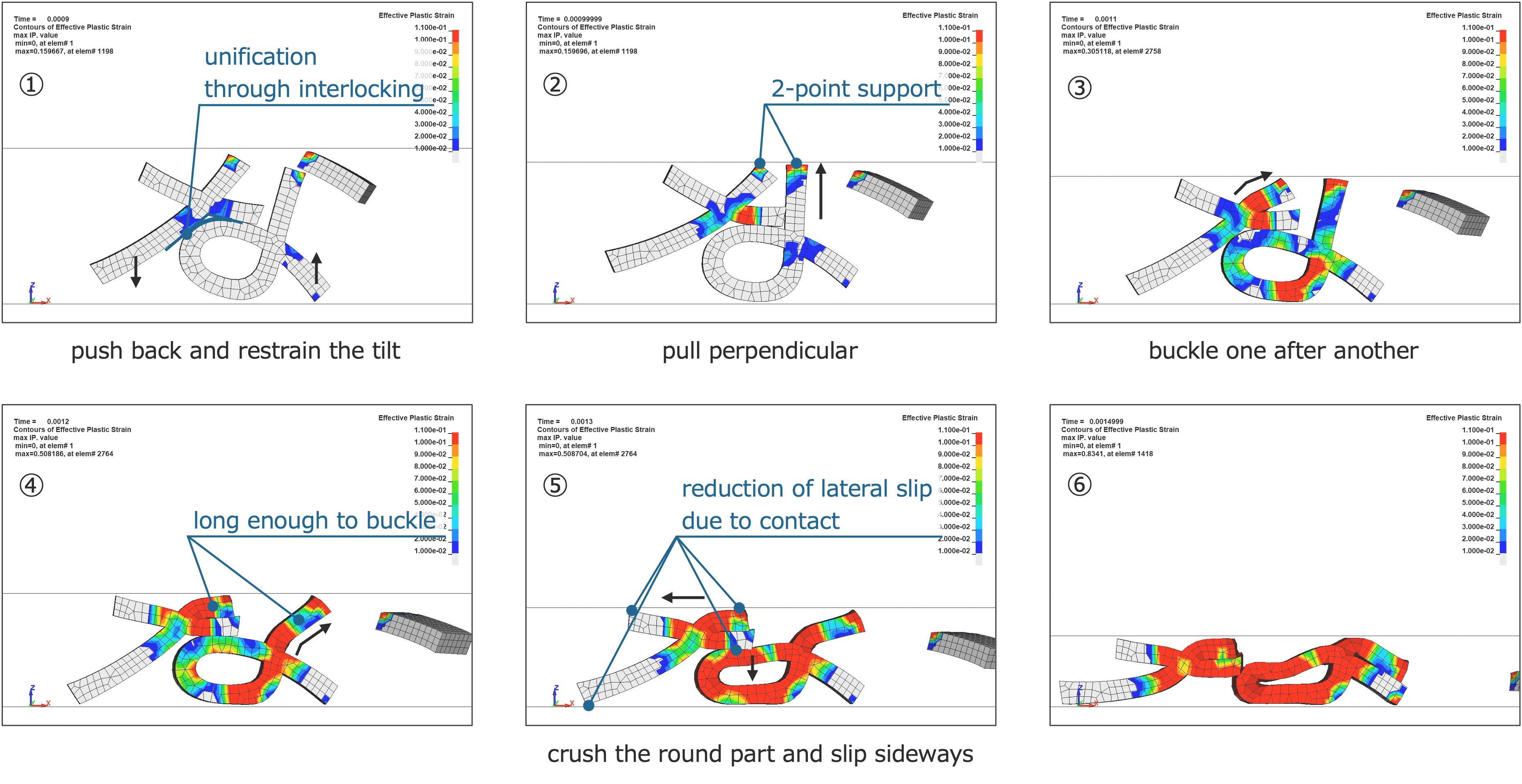
① Unification
The three disparate components are pushed into contact with the upper rigid body. At that time, the intersection element is tangent to the rounded part of the musubi element, so that the two components successfully interlock and are then united and subjected to the force. The intersection element pushes back the right-tilted musubi element, and the endpoint of the musubi element restrains the tilt.
② Compression
The vertical bar of the musubi element pulls perpendicular to the rigid body and begins to exert a reaction force. This contributes to the rise of the FS curve.
③,④ Buckling
The vertical bars buckle one after another and maintain a constant reaction force.
⑤ Buckling and Lateral slip
While crushing the round part of the musubi element, the intersection element is shifted to the left. During this time, the buckling and lateral slip of each section adjusts and maintains the reaction force. In addition, the four ends of the intersection element contact the rigid body and the musubi element, respectively, to reduce lateral slip, allowing the two components to continue receiving forces without separating for a relatively long period of time.
⑥ Separation
The lateral slip of the intersection element reaches its limit. Thereafter, the reaction force is temporarily reduced as the two components cease to overlap, but it gradually rises to the point of collapse.
Summary
From the above, the following two points can be summarized as important in terms of geometry.
-
The angle of the intersection element is appropriate for the curvature of the round part of the musubi element.
⇨ The two components successfully interlock and can take forces as a single unit. -
The length and deformability of the intersection element and the musubi element in the vertical direction are about same.
⇨ The left and right elements buckle in a balanced manner and support each other.
The angles of the intersection element are described as follows.
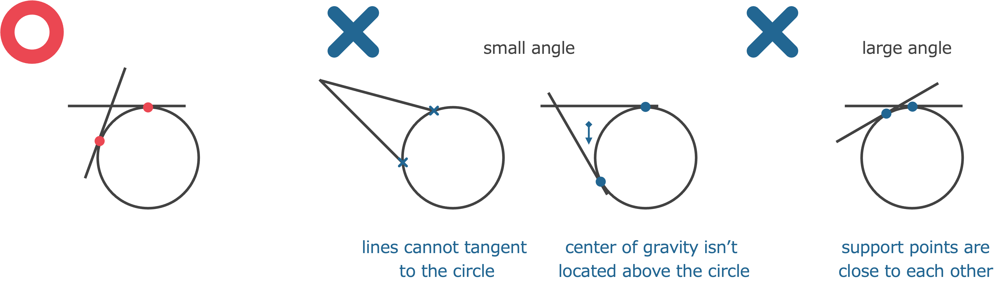
The figure shows a schematic representation of an intersection element and a musubi element as a line and a circle, respectively. At appropriate angles, the intersection element is stable on the musubi element, whereas at other angles, the two components are unstable and diverge. For example, when the angle is small, it cannot tangent to the circle, or even if it does, the center of gravity of the intersection element is located on the left side of the circle, so it tends to tilt to the left when subjected to downward force. Also, when the angle is large, the supporting points (tangent points) are close to each other, so they are easily subjected to moments against the external force, which is also unstable. Thus, when the angle is appropriate, neither too small nor too large, the two components can stay together.
In this way, we see that a seemingly accidental exquisite balance of shapes results in efficient energy absorption.
But is this really a coincidence? Think back to the origins of Hiragana. The "な" was originally formed from the Kanji "奈", with the "大" part being the intersection element and the point element, and the "示" part being the musubi element. Considering this, it may be inevitable that the intersection element takes an appropriate angle to the curvature of the musubi element, since the intersection line of the intersection element and the round part of the musubi element are both made of a horizontal line + left harai (sweeping in Japanese). One may also consider that the similar height of the two components is due to the tendency of Kanji letters to be equally divided into upper and lower parts (radicals and others). (Does this mean that there is a more energy-absorbing shape lurking in the kanji?) It is fun to observe the behavior with this kind of imagination.
Conclusion
I have taken Hiragana as an example of shape exploration and investigated its shape and mechanical properties. The way Hiragana move and collapse is fascinating because it has a unique character that geometric shapes do not have. In particular, the observation focusing on the letter "な" revealed that the balance of the shape holds the key to energy absorption, and I was able to recognize once again the refined beauty of Hiragana and the depth of shape design. I think I was also able to gain new insights by looking at its history and design features. At first glance, shape exploration may seem a little difficult, but just by looking at your favorite shape from a free perspective, I think you will discover something new and enjoyable. I hope that this article has helped you to see the appeal and potential of Hiragana and shape exploration, even if only a little.
Also, there are many articles on our website in which our engineers explain the shape of products from their own unique viewpoints. If you are interested, please take a look.
・Bistable hinge caps | Nature Architects inc.
I appreciate your reading my article all the way through.
References
[1] Shogakukan, “Hiragana”, 精選版 日本国語大辞典, 2005/12, volume 3
[2] Mariko Kinoshita, “‘平仮名’はこうして生まれた”, Nikkei buisiness, 2018/01/23, https://business.nikkei.com/atcl/report/15/280393/092100015/ (Accessed: 2024/07/18)
[3] Heibonsha, “Hiragana”, 百科事典 マイペディア, https://kotobank.jp/word/平仮名-613766 (from Kotobank, Accessed: 2024/07/18)
[4] Min-Young Kim, “Type classification in CJK: Japanese”, Google Fonts,
https://fonts.google.com/knowledge/type_in_china_japan_and_korea/type_classification_in_cjk_japanese (Accessed: 2024/07/18)
[5] Morisawa, “Hiragino Kaku Gothic ProN”, Morisawa Fonts, https://morisawafonts.com/fonts/475/ (Accessed: 2024/07/18)
